Welcome to my digital filing cabinet. Here, I keep evidence of projects whose source code has been lost to corrupted USB sticks, abandoned computers, and my own forgetfulness.
Published
March 8, 2025
d3 =require("d3@7");// Set a "small" screen width thresholdsmall_screen_width =850;// Count the number of foldersn_folders = d3.selectAll(".folder").size();// Initialize the positions and data-attributes of the foldersd3.selectAll(".folder")// Set the positions of folders on thin screen widths, left position is // calculated on re-size such that the folder is centered..attr("data-thinscreen-bottom", (d, i) =>`${(n_folders - i) *50}px`)// Attributes used to hold the current desired setting, based on the screen width..attr("data-z-index", (d, i) =>100+ i).attr("data-left",function() { return d3.select(this).attr("data-widescreen-left") }).attr("data-bottom",function() { return d3.select(this).attr("data-widescreen-bottom") })// Set the z-index and bottom position applied for when a folder is "raised".// Note that by default (on wide-screens) the z-index doesn't change on raise..attr("data-raised-bottom","350px").attr("data-raised-z-index", (d, i) =>100+ i)// Apply the initial styles.style("z-index",function() { return d3.select(this).attr("data-z-index") }).style("left",function() { return d3.select(this).attr("data-left") }).style("bottom",function() { return d3.select(this).attr("data-bottom") });
document.addEventListener("click",function(event) {const screen_width =window.innerWidth;const clicked_element =event.target.closest(".folder");const folders = d3.selectAll(".folder");// Shorten transitions on small screens, since we're not raising the folderconst delay_ms = (screen_width < small_screen_width) ?100:200;const duration_ms = (screen_width < small_screen_width) ?200:300;// const delay_ms = 200;// const duration_ms = 300;const folder_width =354;if (clicked_element) {// We're clicking on the raised folder, do nothingif (d3.select(clicked_element).classed("raised")) {return; }// A folder was clicked, reset all other folders and raise the clicked folder folders.classed("raised",false).call(folder => folder.select(".folder-text").transition().duration(duration_ms).style("opacity",0).on("end",function() { d3.select(this).style("display","none") }) ).call(folder => folder.select(".folder-file-container").transition().duration(duration_ms).style("opacity",0).on("end",function() { d3.select(this).style("display","none") }) )// Set to the current default bottom placement and z-index.style("z-index",function() { return d3.select(this).attr("data-z-index") }).transition().duration(duration_ms).style("bottom",function() { return d3.select(this).attr("data-bottom") });// Raise the clicked folder d3.select(clicked_element).classed("raised",true)// Set to the raised bottom and z-index.style("z-index",function() { return d3.select(this).attr("data-raised-z-index") }).transition().duration(duration_ms).style("bottom",function() { return d3.select(this).attr("data-raised-bottom") });// Show the contents of the folder d3.select(clicked_element).classed("raised",true).call(folder => folder.select(".folder-text").style("display","inline").style("opacity",0).transition().delay(delay_ms).duration(duration_ms).style("opacity",1) ).call(folder => folder.select(".folder-file-container").style("display","flex").style("opacity",0).transition().delay(delay_ms).duration(duration_ms).style("opacity",1) ); } else {// Clicked outside of any folder, reset all folders folders.classed("raised",false).call(folder => folder.select(".folder-text").transition().duration(duration_ms).style("opacity",0).on("end",function() { d3.select(this).style("display","none") }) ).call(folder => folder.select(".folder-file-container").transition().duration(duration_ms).style("opacity",0).on("end",function() { d3.select(this).style("display","none") }) )// Set to the current default bottom placement and z-index.style("z-index",function() { return d3.select(this).attr("data-z-index") }).transition().duration(duration_ms).style("bottom",function() { return d3.select(this).attr("data-bottom") }); }});
stack_folders =function() {const folders = d3.selectAll(".folder");const n_folders = folders.size();const screen_width =window.innerWidth;const cabinet_width = d3.select(".file-cabinet").node().offsetWidth;const folder_width =354;const new_left =`${(cabinet_width - folder_width) /2}px`;// Reset any open folders on screen re-size folders.classed("raised",false).call(folder => folder.select(".folder-text").style("opacity",0)).call(folder => folder.select(".folder-file-container").style("opacity",0)).style("z-index",function() { return d3.select(this).attr("data-z-index") }).style("bottom",function() { return d3.select(this).attr("data-bottom") });if (screen_width < small_screen_width) {// If we're on a small screen, move all folders to the center of the screen// and "stack" them. folders.attr("data-bottom",function() { return d3.select(this).attr("data-thinscreen-bottom") }).style("bottom",function() { return d3.select(this).attr("data-thinscreen-bottom") }).style("left", new_left)// On small screens, we don't increase the folder's height, we change it's // z-index to position it in front of other folders..attr("data-raised-bottom",function() { return d3.select(this).attr("data-thinscreen-bottom") }).attr("data-raised-z-index",200); } else {// If we're on a large screen, re-set to the folders' wide-screen positions folders// We don't need an updating "data-left", since raising the folder doesn't// change the left-position, so we don't need to record an original left-position..attr("data-bottom",function() { return d3.select(this).attr("data-widescreen-bottom") }).style("bottom",function() { return d3.select(this).attr("data-widescreen-bottom") }).style("left",function() { return d3.select(this).attr("data-widescreen-left") })// On large screens, we raise the increase the folder's height and don't// change it's z-index.attr("data-raised-bottom","350px").attr("data-raised-z-index",function() { return d3.select(this).attr("data-z-index") }); }};// Re-position the folders whenever the window is re-sized. This is necessary to// keep the folder stack in the center of the screen on thin screen widths.window.addEventListener("resize", stack_folders);
window.onload=function() { stack_folders() };
set_divider_height =function(query) {const thinscreen_height ="350px";const widescreen_height ="225px";if (query.matches) { d3.select(".divider").style("height", thinscreen_height); } else { d3.select(".divider").style("height", widescreen_height); }}// Initialize the divider height and set on changequery_screen_width =window.matchMedia(`(max-width: ${small_screen_width}px)`);set_divider_height(query_screen_width);
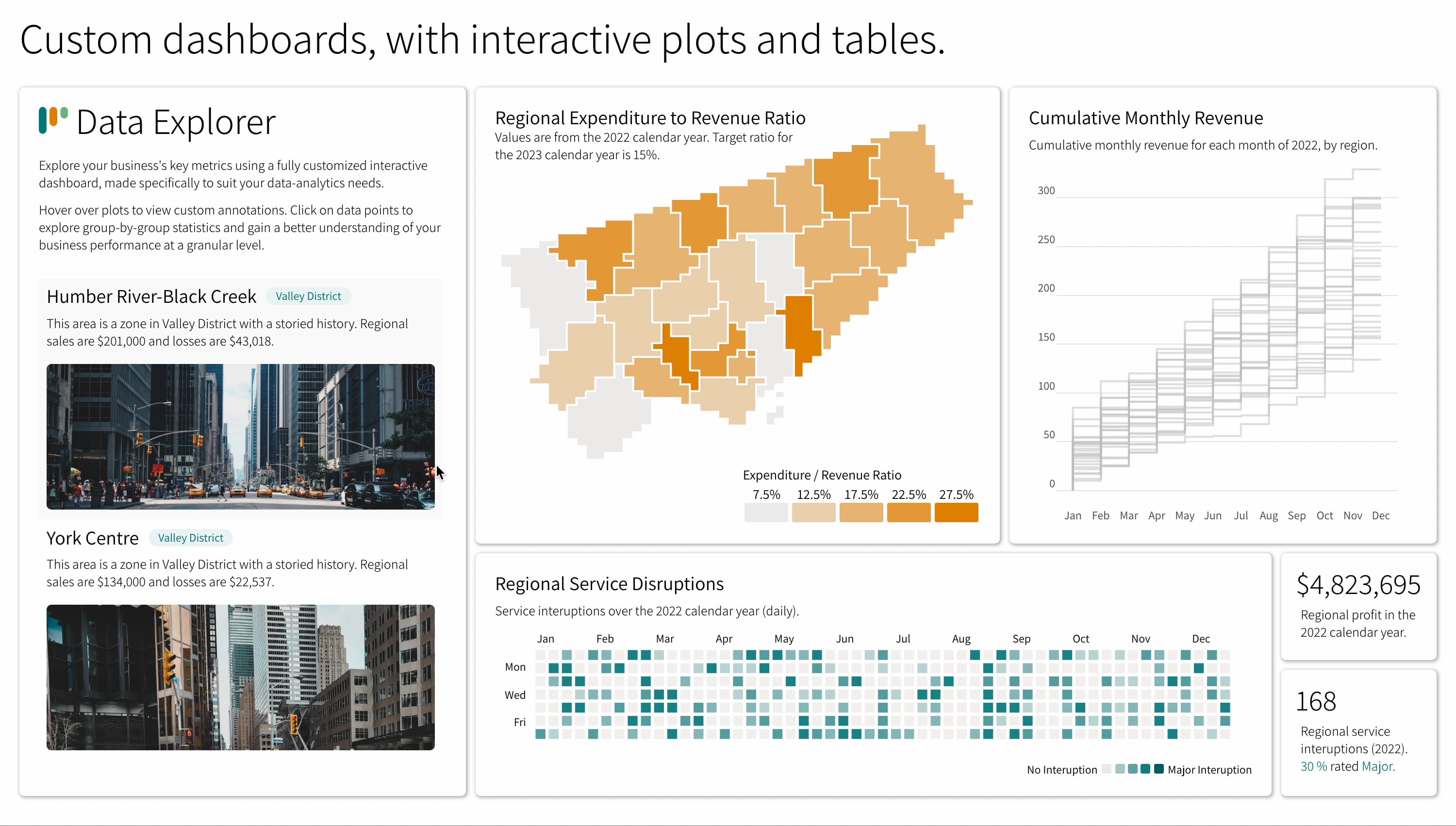
Dashboard
I am a frequent victim of my own wild disregard for my personal time, which once
manifested in a short-lived quest to sell interactive dashboards as a freelancer
on Fiverr. I created this dashboard for my
freelancer page, using R and the {plotly}
interactive graphing library.
terminal.mp4
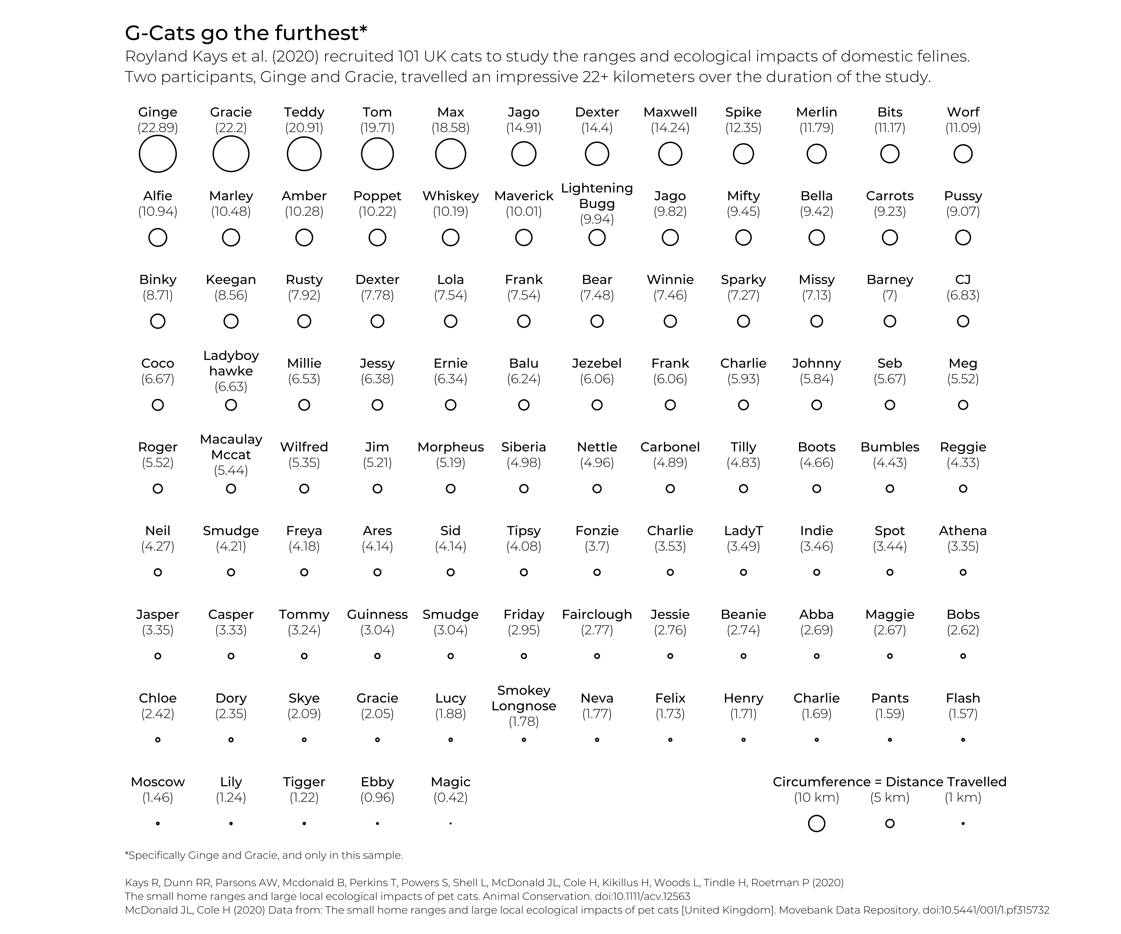
TidyTuesday Cats
My TidyTuesday 2023-01-31
plot draws the distance traveled by a group of GPS-strapped cats, a choice informed
by my desire to show off some great cat names - shoutout to Smudge and Macaulay Mccat.
cats.svg
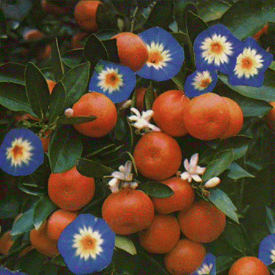
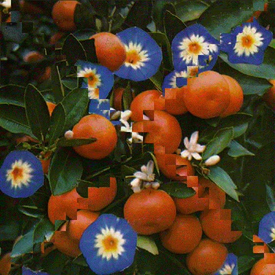
Color Sorting
These are the outputs of a program which used Python's Pillow
imaging library to sub-divide images into a grid of small squares and re-arrange
those squares into a new image.
Currency Terminal
This is a tiny terminal application coded mostly in Python with a little bit
of R. It fetches current and historical global currency
exchange data and features a mostly-ASCII-display, complete with a scrolling
currency ticker.
terminal.mp4
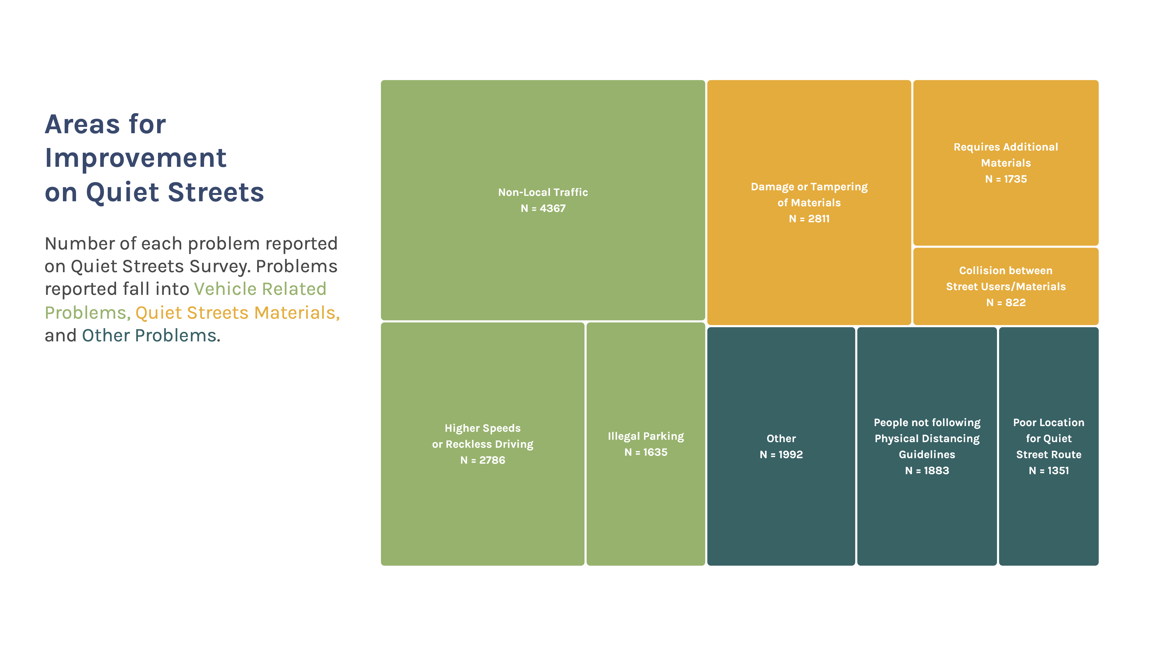
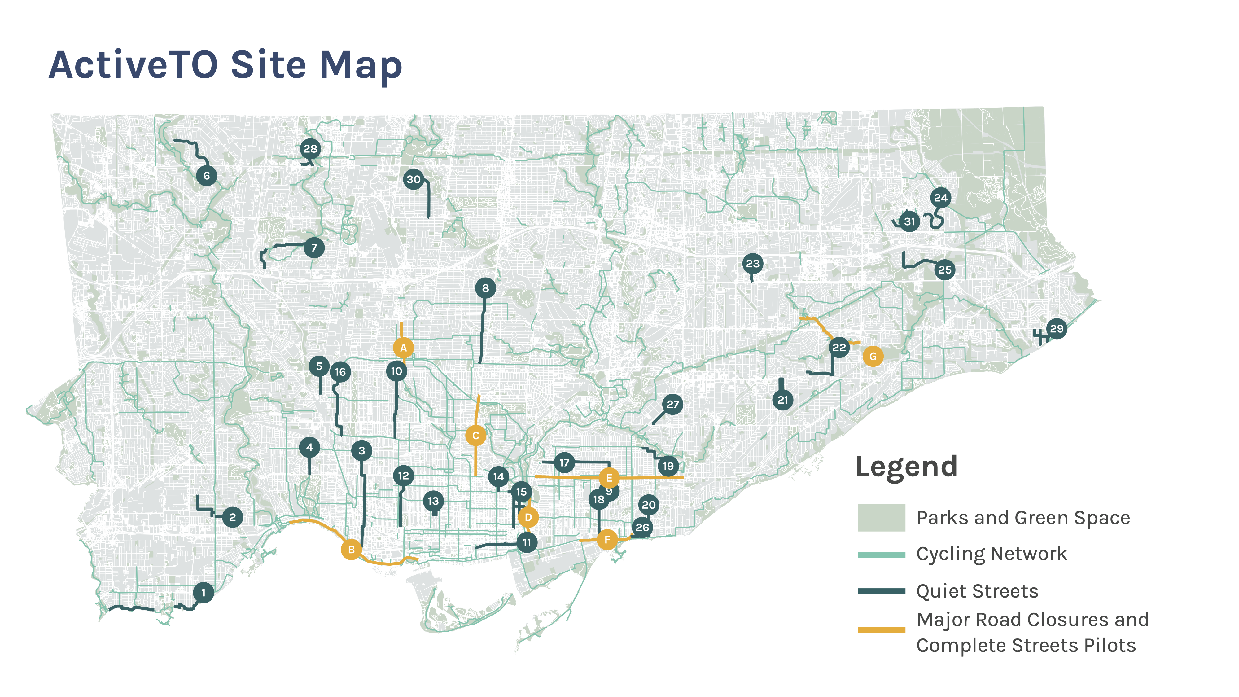
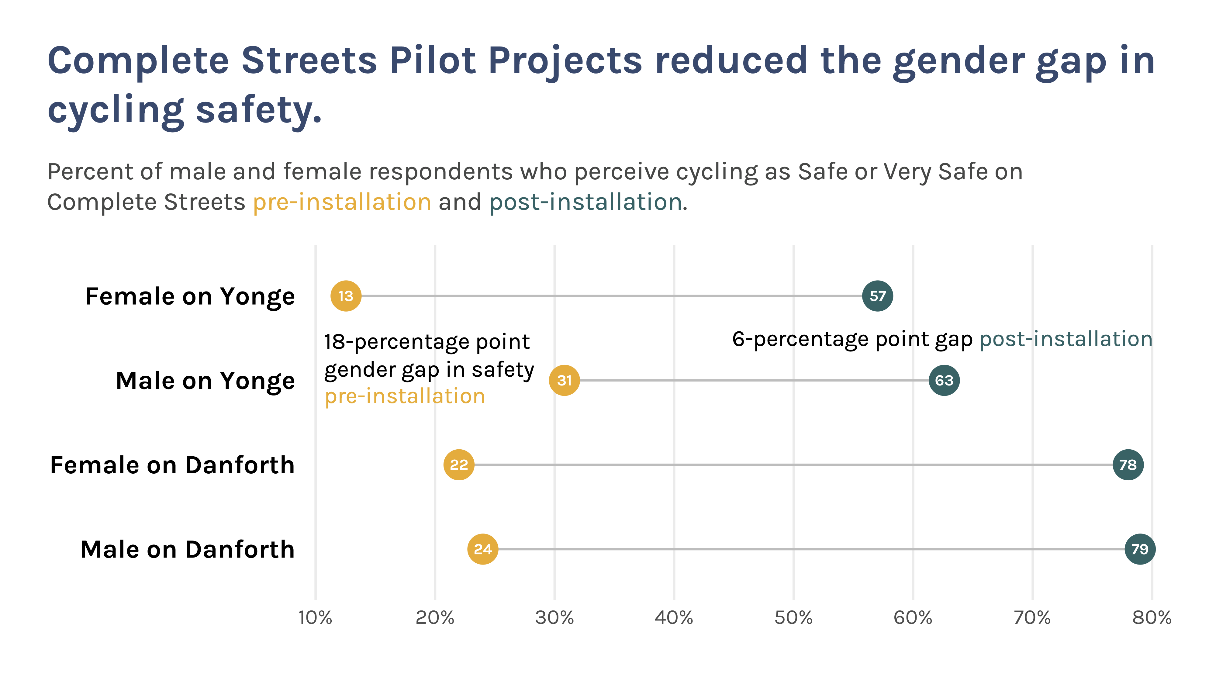
TCAT Report
These are a few slides from a presentation I gave at the end of an intership
with The Center for Active Transportation (TCAT). I was tasked with
measuring the effectiveness of transport programs put in place during the COVID-19
pandemic by the City of Toronto.
 Dashboard
I am a frequent victim of my own wild disregard for my personal time, which once
manifested in a short-lived quest to sell interactive dashboards as a freelancer
on Fiverr. I created this dashboard for my
freelancer page, using R and the {plotly}
interactive graphing library.
Dashboard
I am a frequent victim of my own wild disregard for my personal time, which once
manifested in a short-lived quest to sell interactive dashboards as a freelancer
on Fiverr. I created this dashboard for my
freelancer page, using R and the {plotly}
interactive graphing library.